I’d never done graphing on the Pi or in Python before, but for my KickStarter tracker I wanted something that…
- was web based
- would work in Python
- had decent instructions
- I could get going with fairly quickly
I’d seen Rachel Rayns tweet about using plot.ly for graphing the temperature output of her Chef’s HAT sous vide cooker. I know Rachel loves “human readable instructions”, as do I. So I thought there was a good chance the plotly documentation was good. I decided to give them a shot.
Sign Up For An Account
The first thing you have to do is sign up for an account. After that, you get some special keys and passwords that you can use in your Python scripts to authenticate with the Plot.ly Applications Programming Interface (API).
You can sign up for a Plot.ly account here by pressing the “sign up” button.
Get Your Credentials
Once you’ve signed up, you need to visit this page to get your API credentials
You will see some similar instructions on the Plot.ly page, but the ones below are tailored for use on the Raspberry Pi…
sudo apt-get update (this may take a minute or so)
sudo apt-get install python-pip
sudo pip install plotly
(if you ever need to upgrade plotly, sudo pip install plotly --upgrade)
After installing plotly, you can ‘register’ your Pi (more specifically, your SD card) with Plotly with the following. You should be able to cut and paste this code with your API keys already in it from the Plotly getting started page…
python -c "import plotly; plotly.tools.set_credentials_file(username='yourPlotlyID', api_key='yourKey', stream_ids=['yourID1', 'yourID2'])"
On the Raspberry Pi, this seems to work beautifully. When I’d got my script working on the Pi, I put it on my web server and it failed intermittently until I put the plotly credentials in the script itself, near the top, like this…
#!/usr/bin/env python2.7
# -*- coding: utf-8 -*-
import plotly.plotly as py
from plotly.graph_objs import *
py.sign_in('yourPlotlyID','yourKey')
…we’re not using the streaming facility, so no need for the streaming IDs.
What Next?
There’s a very nice ‘getting started’ example on the Plotly Getting Started Page. I’ve reproduced it below. It’s a very simple intro into using plotly to create a basic x,y scatter graph.
import plotly.plotly as py
from plotly.graph_objs import *

trace0 = Scatter(
    x=[1, 2, 3, 4],
    y=[10, 15, 13, 17]
)
trace1 = Scatter(
    x=[1, 2, 3, 4],
    y=[16, 5, 11, 9]
)
data = Data([trace0, trace1])

unique_url = py.plot(data, filename = 'basic-line')
The above code will create a graph on the Plot.ly server under your account. The graph will be called basic-line. You can view it by going to plot.ly, logging into your account and clicking on workspace. You shoud then see a list of graphs (well, only one if you’re just starting out). In this list should be basic-line
If you click on basic-line it should show you a graph.
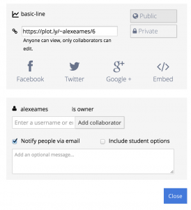
In the top right of the page, is a blue button called “share”…
If you click the share button it gives you various sharing options, links, twitter links, embed codes for websites/blogs etc.
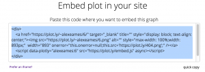
To get an interactive graph on this blog page, I clicked embed…
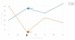
And if you actually embed that code on the page, you get this interactive graph. If you ‘mouse over’ any of the points, it gives you the data…
Basics Done, Now Let’s Use It
All the scripts described here and previously are to be found in my GitHub repository here
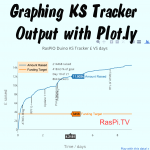
It took me a couple of days’ worth of ‘messing about’ time to work up the following Python script whichs reads data from the log file created by the ks4.py tracker script, extract the relevant data, and generate a Plot.ly graph. This is the output of the kslog-raspio.py script…
I’m running this script on my server (as a ‘cron job’) to refresh the graph every 10 minutes or so. The nice thing is that, because the server is a Linux machine, I was abe to prototype the whole thing on the Pi and then upload it to the server with minimal changes (cron is fussy about full file paths). It’s now sitting there doing its job of graphing the RasPiO Duino KickStarter campaign.
Here’s the Code
You will need to insert your own plotly API keys, unless you’ve done the authentication described above (in which case comment out line 5).
This code relies on the output of ks4.py, namely a file called raspio.txt. All the KickStarter tracker code (including the script below) is available in my GitHub repository here
If people are interested I will do a walkthrough of the code in a further blog article. Please leave a comment if you’d like me to do that.
#!/usr/bin/env python2.7
# -*- coding: utf-8 -*-
import plotly.plotly as py
from plotly.graph_objs import *
py.sign_in('yourPlotlyID','yourKey')

logfile ='raspio.txt'

read_log = open(logfile, 'r') # open file for reading
lines = read_log.readlines()
read_log.close()

y_axis = [0,]    # added a 0 to force the point 0,0
x_axis = [0,]    # in both x and y
y_axis2 = []
pc = '%'
project_currency_symbol = '£'
project_currency = 'gbp'

logo_x = 0.87    # set default RasPi.TV annotation positions
logo_y = 0.05
legend_y = 1

# grab the last line and extract hours_into_campaign
hours_into_campaign = float(lines[-1].split(',')[8])
try:
    if lines[-1].split(',')[9]:
        project_currency =  lines[-1].split(',')[9][0:3]
except:
    pass

# here you put some logic to determine project currency symbol
# project_currency_symbol
if project_currency == 'usd':
    project_currency_symbol = '$'

y_title = project_currency_symbol + ' raised'
percent = float(lines[-1].split(',')[1])
day_of_campaign = int((hours_into_campaign / 24) + 1)
campaign_duration = int(float(lines[-1].split(',')[3]))
if day_of_campaign > campaign_duration:
    day_string = 'Campaign Ended'
else:
    day_string = 'Day %d of %d' % (day_of_campaign, campaign_duration)
backers = str(int(lines[-1].split(',')[6]))
backer_string = backers + ' backers'

if percent <= 25:
    logo_y = 0.4
if percent <= 120:
    legend_y = 0.9
percent_string = '%.2f %s of goal' % (percent, pc)

if hours_into_campaign >= 72:
    divisor = 24
    title_string = 'RasPiO Duino KS Tracker %s VS days' % project_currency_symbol
    time_unit = 'days'
    x_title = 'Time / days'
else:
    divisor = 1
    title_string = 'RasPiO Duino KS Tracker %s VS hours' % project_currency_symbol
    time_unit = 'hours'
    x_title = 'Time / hours'

# graph amount raised vs hours/days into campaign
for line in lines:
    amount_raised = int(float(line.split(',')[2]))   # y
    hours_into_campaign = float(line.split(',')[8])  # x
    target = int(float(line.split(',')[0]))
    y_axis.append(amount_raised)
    x_axis.append(round(hours_into_campaign/divisor,4))          # days or hours
    y_axis2.append(target)
y_axis2.append(target)               # one extra to maintain the correct list length

total_so_far = '%s%d raised' % (project_currency_symbol, amount_raised)

trace0 = Scatter(
    x=x_axis,
    y=y_axis,
    name='Amount Raised'
)
trace1 = Scatter(
    x=x_axis,
    y=y_axis2,
    name='Funding Target'
)

data = Data([trace0,trace1])
layout = Layout(
    paper_bgcolor='#EBFFFF',
    plot_bgcolor='#F5FFFF',
    showlegend=True,
    legend=Legend(
        x=0,
        y=legend_y,
        font=Font(
            family='sans-serif',
            size=12,
            color='#000'
        ),
        bgcolor='#FFE7C6'
    ),
    annotations=Annotations([
        Annotation(
            x=logo_x,
            y=logo_y,
            xref='paper',
            yref='paper',
            xanchor='right',
            yanchor='bottom',
            text='RasPi.TV',
            font=Font(
                family='Arial, sans-serif',
                size=30,
                color='#ff0000'
            ),
            align='center',
            bordercolor='#FFFFFF',
            borderwidth=2,
            borderpad=4,
            bgcolor='#FFFFFF',
            opacity=0.8
        ),
        Annotation(
            x=0.3,
            y=legend_y,      # level with top of legend
            xref='paper',
            yref='paper',
            xanchor='left',
            yanchor='top',
            text=total_so_far,
            showarrow=False,
        ),
        Annotation(
            x=0.3,
            y=(legend_y - 0.07), # 1 row down from previous
            xref='paper',
            yref='paper',
            xanchor='left',
            yanchor='top',
            text=percent_string,
            showarrow=False,
        ),
        Annotation(
            x=0.3,
            y=(legend_y - 0.14), # 1 row down from previous
            xref='paper',
            yref='paper',
            xanchor='left',
            yanchor='top',
            text=day_string,
            showarrow=False,
        ),
        Annotation(
            x=0.3,
            y=(legend_y - 0.21), # 1 row down from previous
            xref='paper',
            yref='paper',
            xanchor='left',
            yanchor='top',
            text=backer_string,
            showarrow=False,
        ),
    ]),
    title=title_string,
    xaxis=XAxis(
        title=x_title,
        titlefont=Font(
            family='Arial, sans-serif',
            size=18,
            color='#7f7f7f'
        )
    ),
    yaxis=YAxis(
        title=y_title,
        titlefont=Font(
            family='Arial, sans-serif',
            size=18,
            color='#7f7f7f'
        )
    )
)
fig = Figure(data=data, layout=layout)
unique_url = py.plot(fig, filename = 'raspio-duino')

# for use on server with cron, add your full path to the filename
Have fun with Plot.ly and don’t forget to visit the RasPiO Duino KS page.


Neat!
Today’s Quick Python Tips ;)
(these aren’t criticisms, just helpful suggestions)
read_log = open(logfile, ‘r’)
lines = read_log.readlines()
read_log.close()
can be squished to just:
lines = open(logfile, ‘r’).readlines()
I personally hate seeing duplicated code, so all the repeated usages of “lines[-1].split(‘,’)” really jumped out at me. An alternative might be to do:
latest_stats = lines[-1].split(‘,’)
hours_into_campaign = float(latest_stats[8])
try:
if latest_stats[9]:
project_currency = latest_stats[9][0:3]
etc…
Alternatively, rather than manually splitting on commas and then remembering which array index corresponds to which field, an even better approach would be to use https://docs.python.org/2/library/csv.html#csv.DictReader
And lastly where you have:
y=legend_y, # level with top of legend
y=(legend_y – 0.07), # 1 row down from previous
y=(legend_y – 0.14), # 1 row down from previous
y=(legend_y – 0.21), # 1 row down from previous
I’d probably do it as:
label_height = 0.07
y=(legend_y – (0 * label_height)),
y=(legend_y – (1 * label_height)),
y=(legend_y – (2 * label_height)),
y=(legend_y – (3 * label_height)),
which would then give you more freedom to change your label_height at a later date :-)
Well done on doing so fantastically well with RasPiO Duino!
As always – great tips Andrew. Thanks :)
[…] Alex Eames has been experimenting with the API of an online service called Plot.ly which allows you to send it a packet full of data which it then plots into a graph. He’s written some sample code and instructions for you to do it yourself. Read it here. […]
[…] Great tutorial for using plot.ly with your Pi from RasPi.tv. […]